Introduction
Table of ContentsGrocery stores and convenience stores are not equally distributed in counties in the United States. Grocery stores typically sell a wide variety of foods and household goods such as fresh fruits, vegetables, and meat as well as canned and prepared foods. Convenience stores normally only carry a limited variety of prepared foods at a higher cost than grocery stores. The unequal distribution of these means that some areas will not have as easy access to fresh and/or cheaper foods available at grocery stores. In this project I will create a model using socioeconomic variables to predict the ratio of convenience to grocery stores in a county. A high value for this ratio likely means that it is more difficult to access a grocery store.
# Libraries and functions to be used
import math
import pandas as pd
import numpy as np
import matplotlib.pyplot as plt
import seaborn as sns
from scipy.stats import ttest_ind
from sklearn.preprocessing import RobustScaler, PolynomialFeatures
from sklearn.model_selection import train_test_split, learning_curve, validation_curve
from sklearn.model_selection import GridSearchCV, RandomizedSearchCV
from sklearn.linear_model import LinearRegression, LassoCV, RidgeCV, ElasticNetCV
from sklearn.ensemble import BaggingRegressor, RandomForestRegressor, GradientBoostingRegressor
from sklearn.metrics import make_scorer, mean_squared_error
from yellowbrick.regressor import ResidualsPlot
Data Wrangling
Table of ContentsFor this project, I identified three datasets which contained variables of interest:
- The United States Department of Agriculture’s Food Access Research Atlas
- Supplemental Data - County
- FIPS (A unique identifier for each county)
- County
- State
- Population Estimate, 2015
- STORES
- FIPS
- GROCPTH14 (Number of grocery stores per thousand population)
- SUPERCPTH14 (Number of supercenter stores per thousand population)
- CONVSPTH14 (Number of convenience stores per thousand population)
- SOCIOECONOMIC
- Kept all variables
- Supplemental Data - County
- The Internal Revenue Service’s Statistics of Income
- FIPS (columns 0 & 2)
- agi_stub (The Adjusted Gross Income Bracket numbered 1-8)
- 1 = Under $1
- 2 = $1 under $10,000
- 3 = $10,000 under $25,000
- 4 = $25,000 under $50,000
- 5 = $50,000 under $75,000
- 6 = $75,000 under $100,000
- 7 = $100,000 under $200,000
- 8 = $200,000 or more
- N1 (The number of returns filed in a county in an income bracket)
- The American Community Survey’s 5-year estimates of educational attainment
- GEO.id2 (FIPS)
- HC_02_EST_VC17 (% of population high school graduate or higher)
- HC_02_EST_VC18 (% of population bachelor's degree or higher)
Importing the 3 datasets with only variables of interest
atlas = 'Data/Food environment atlas.xls'
county_columns = ['FIPS', 'County', 'State', 'Population Estimate, 2015']
county_data = pd.read_excel(atlas,
                            sheet_name='Supplemental Data - County',
                            usecols=county_columns)
stores_columns = ['FIPS', 'GROCPTH14', 'SUPERCPTH14', 'CONVSPTH14']
stores = pd.read_excel(atlas, sheet_name='STORES', usecols=stores_columns)
socioeconomic = pd.read_excel(atlas, sheet_name='SOCIOECONOMIC')

income = pd.read_csv('Data/15incyallagi.csv', usecols=[0,2,4,5])

education_columns = ['GEO.id2', 'HC02_EST_VC17', 'HC02_EST_VC18']
education = pd.read_csv('Data/ACS_15_5YR_S1501_with_ann.csv',
                        usecols=education_columns,
                        skiprows=[1],
                        encoding='latin-1')
Transforming data before merging
Some state and county names have leading/trailing spaces that need to be removed. I also need to create a dictionary matching state with FIPS code.
county_data['County'] = county_data['County'].str.strip()
county_data['State'] = county_data['State'].str.strip()
state_FIPS = (pd.DataFrame([county_data['State'],
                            county_data['FIPS'] // 1000])
              .transpose()
              .groupby(by='State').max()
              .to_dict()['FIPS']
              )
I need to create my variable of interest is the ratio of convenience stores to grocery stores and supercenters.
    stores['conv_to_groc'] = (stores['CONVSPTH14'] /
                              (stores['GROCPTH14'] + stores['SUPERCPTH14']))
                             .replace(np.inf, np.nan)
I do not want to duplicate the state and county when merging I drop them.
socioeconomic.drop(['State', 'County'], axis='columns', inplace=True)Renaming the education columns to something useful
education.columns = ['FIPS', 'high_school_pct', 'bachelor_pct']The FIPS used in the other datasets is stored in two columns in the income data. The income data needs to be pivoted so that there is one row per county. The values should be normalized to the total number of returns filed in each county.
income['FIPS'] = (income['STATEFIPS'].astype(str) +
                  income['COUNTYFIPS'].astype(str)
                                      .apply(str.rjust, args=(3,'0')))
                 .astype(int)
income_pivot = income.pivot_table(index='FIPS',
                                  columns='agi_stub',
                                  values='N1',
                                  margins=True,
                                  aggfunc=sum)
for col in income_pivot.columns:
    income_pivot[col] = income_pivot[col] / income_pivot['All'] * 100
income_pivot.drop('All', axis='columns', inplace=True)
income_pivot.columns = ['income_pct' + str(x) for x in range(1,9)]
income_pivot = income_pivot.reset_index()
The datasets are ready to be merged
merge1 = county_data.merge(stores, how='left', on='FIPS')
merge2 = merge1.merge(socioeconomic, how='left', on='FIPS')
merge3 = merge2.merge(education, how='left', on='FIPS')
merge4 = merge3.merge(income_pivot, how='left', on='FIPS')
merge4 = merge4.set_index(['State', 'County','FIPS'])
merge4.info()

MultiIndex: 3142 entries, (Alabama, Autauga, 1001) to (Wyoming, Weston, 56045)
Data columns (total 30 columns):
Population Estimate, 2015    3142 non-null object
GROCPTH14                    3140 non-null float64
SUPERCPTH14                  3140 non-null float64
CONVSPTH14                   3140 non-null float64
conv_to_groc                 3072 non-null float64
PCT_NHWHITE10                3140 non-null float64
PCT_NHBLACK10                3140 non-null float64
PCT_HISP10                   3140 non-null float64
PCT_NHASIAN10                3140 non-null float64
PCT_NHNA10                   3140 non-null float64
PCT_NHPI10                   3140 non-null float64
PCT_65OLDER10                3140 non-null float64
PCT_18YOUNGER10              3140 non-null float64
MEDHHINC15                   3139 non-null float64
POVRATE15                    3139 non-null float64
PERPOV10                     3140 non-null float64
CHILDPOVRATE15               3139 non-null float64
PERCHLDPOV10                 3140 non-null float64
METRO13                      3140 non-null float64
POPLOSS10                    3140 non-null float64
high_school_pct              3142 non-null float64
bachelor_pct                 3142 non-null float64
income_pct1                  3141 non-null float64
income_pct2                  3141 non-null float64
income_pct3                  3141 non-null float64
income_pct4                  3141 non-null float64
income_pct5                  3141 non-null float64
income_pct6                  3141 non-null float64
income_pct7                  3141 non-null float64
income_pct8                  3141 non-null float64
dtypes: float64(29), object(1)
memory usage: 791.3+ KB
merge4['Population Estimate, 2015'] = (merge4['Population Estimate, 2015']
                                      .str.replace(',', '')
                                      .astype('float64')
                                      )
merge4['METRO13'] = merge4['METRO13'].astype('category')
merge4['PERCHLDPOV10'] = merge4['PERCHLDPOV10'].astype('category')
merge4['PERPOV10'] = merge4['PERPOV10'].astype('category')
merge4['POPLOSS10'] = merge4['POPLOSS10'].astype('category')
merge4.columns = merge4.columns.str.lower()
Missing Data
merge4[merge4.drop('conv_to_groc', axis=1).isna().sum(axis='columns') > 0]

There are three rows with missing data and they are all missing many values, and so I will drop them.
merge4.dropna(thresh=29, inplace=True)There are 67 rows where conv_to_groc is missing because there are zero grocery stores in the county and dividing by zero is undefined. Those where the number of convenience stores is also zero will be set to 0. As will be seen later one good predictor of this ratio is median household income. To fill the rest of the missing values, I will create 20 bins of the income variable and use the maximum ratio in each bin.
merge4['bins'] = pd.cut(merge4['medhhinc15'],bins=20)
ratio_by_income = merge4.groupby(by='bins')['conv_to_groc'].max()

def fill_ratio(row):
    if np.isnan(row['conv_to_groc']) and row['convspth14'] == 0:
        return 0
    elif np.isnan(row['conv_to_groc']) and row['convspth14'] != 0:
            return ratio_by_income[row['medhhinc15']]
    else:
        return row['conv_to_groc']

merge4['conv_to_groc'] = merge4.apply(lambda row: fill_ratio(row), axis=1)
df = merge4.drop('bins', axis=1).copy()
df.to_pickle('Data\Capstone_Milestone.pkl')
Exploratory Data Analysis
Table of ContentsQuestions to investigate:
- How are these data distributed?
- Which if any variables have a linear correlation?
- Are there strong correlations between pairs of independent variables or between an independent and a dependent variable?
- Which varibles have the strongest correlations with the variable conv_to_groc
- Are there significant differences between subgroups in your data that may be relevant to your project aim?
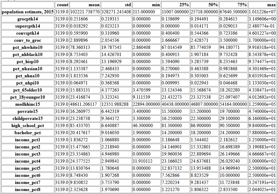
df.describe().transpose()
continuous = df.loc[:,df.dtypes == 'float64'].copy()
f, axes = plt.subplots(6, 5, figsize=(20,25))
for k, col in enumerate(continuous.columns):
    continuous.boxplot(column=col, ax=axes[k//5, k%5])
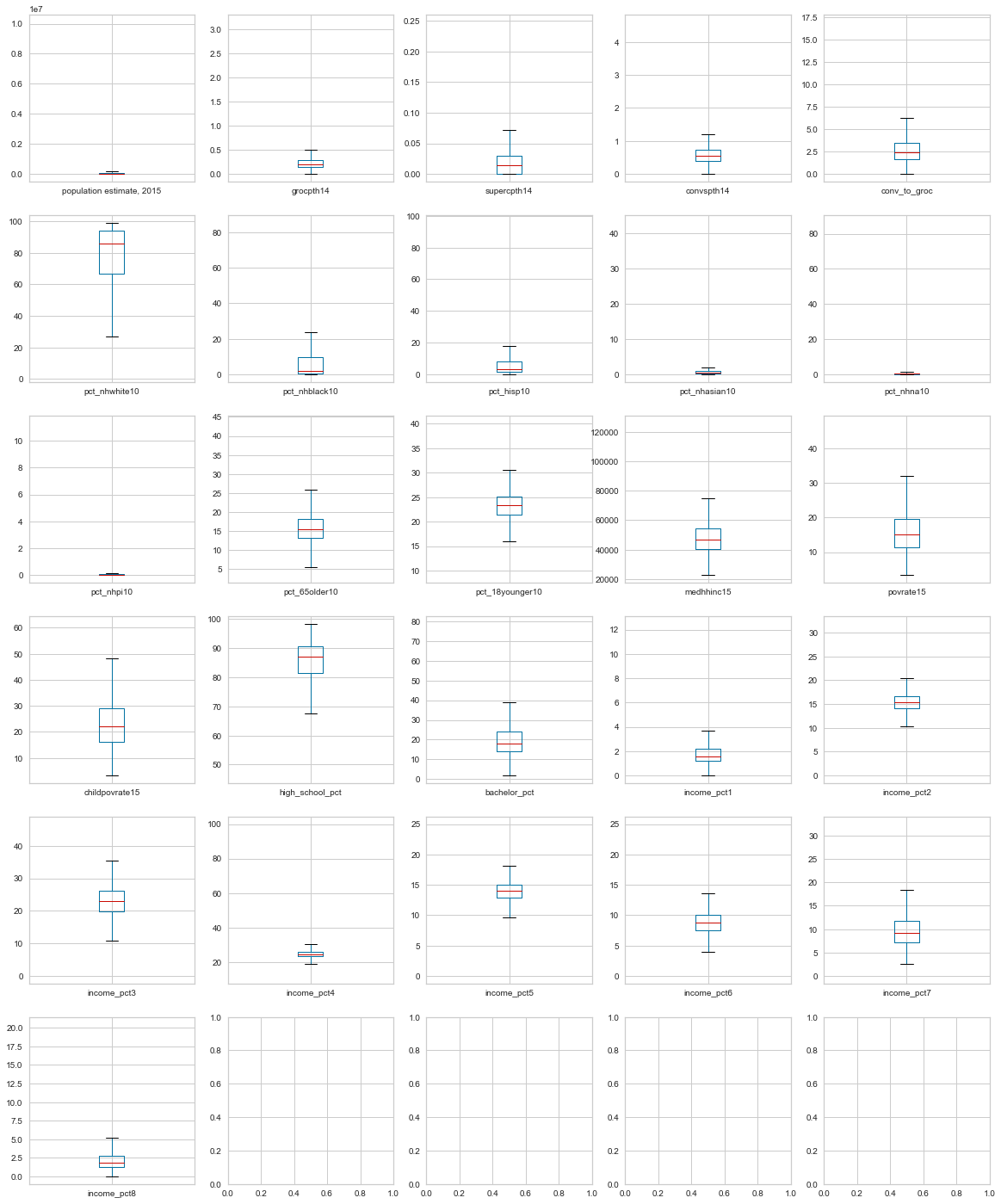
All of these boxplots have counties outside the whiskers, but most show a continuous distribution to the minimum or maximum. income_pct4 has a point very far from the rest.
df.describe().transpose()
There are 115 people in that county, so it is possible all the filed returns are in one bracket.
plt.figure(figsize=(12,10))
sns.heatmap(df.corr(), vmin=-1, vmax=1)
plt.show()
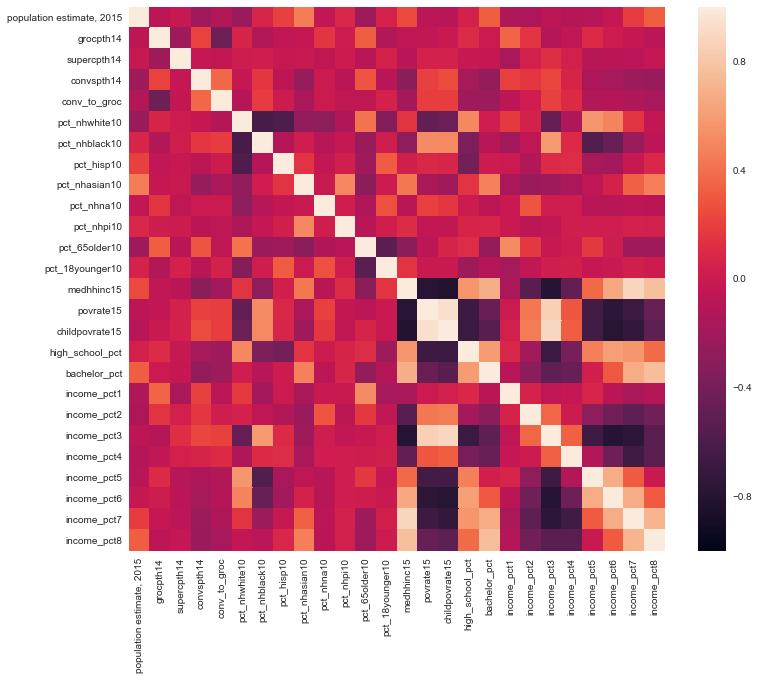
This heatmap mainly shows the obvious; household income is correlated with the poverty rate and with other income brackets. To investigate the correlations better, I will filter the correlation matrix for |correlation| > 0.5
corr_mat = df.iloc[:,:22].corr()
corr_mat5 = (corr_mat
              .apply(lambda srs: srs
                     .map(lambda x:
                          None if ((x > -0.5) and (x < 0.5)) or x==1 else x)))
corr_mat5.iloc[corr_mat5.notnull().sum().values.astype(bool),
               corr_mat5.notnull().sum().values.astype(bool)]

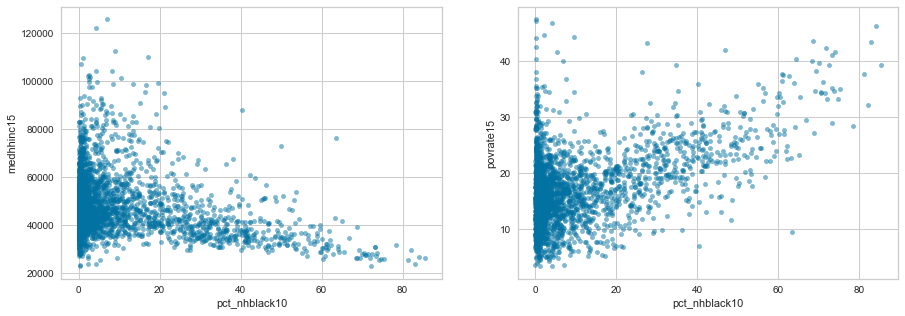
Now we can observe some correlations that are not trivial such as the median household income increasing as high school graduation rate increases or the increase in poverty rate with increasing percent of population who is black.
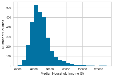
As many of these of these larger correlations involve median household income, let's look first at its histogram and CDF.
df['medhhinc15'].hist(bins=22, range=(20000, 130000))
plt.xlabel('Median Household Income ($)')
plt.ylabel('Number of Counties')
plt.show()
plt.hist(df['medhhinc15'],
         density=True,
         cumulative=True,
         label='CDF',
         histtype='step',
         alpha=0.8,
         color='k',
         bins=22,
         range=(20000, 130000))
plt.xlabel('Median Household Income ($)')
plt.ylabel('CDF')
plt.show()
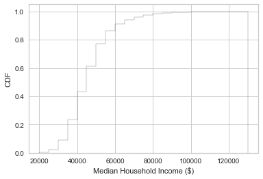
These show that 80% of counties have a median household income $60,000 or less, and that there is a very long tail.
f, axes = plt.subplots(1, 2, figsize=(15,5))
df.plot.scatter('high_school_pct', 'medhhinc15', alpha=0.5, ax=axes[0])
df.plot.scatter('bachelor_pct', 'medhhinc15', alpha=0.5, ax=axes[1])
axes[0].plot([70, 95], [25000, 40000], 'r-')
axes[0].plot([70, 95], [30000, 80000], 'r-')
axes[1].plot([10, 50], [25000, 65000], 'r-')
axes[1].plot([10, 50], [53000, 93000], 'r-')
plt.show()
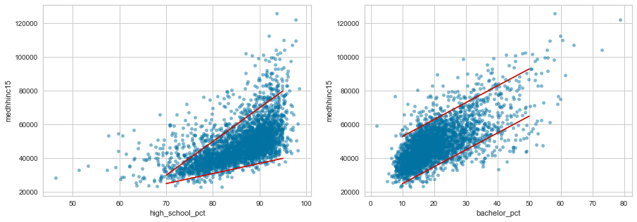
While the variation in median household income appears to grow larger as high school graduation percent increases, the variation stays fairly uniform as the percentage with a bachelor's degree changes.
f, axes = plt.subplots(1, 2, figsize=(15,5))
df.plot.scatter('pct_nhblack10', 'medhhinc15', alpha=0.5, ax=axes[0])
df.plot.scatter('pct_nhblack10', 'povrate15', alpha=0.5, ax=axes[1])
plt.show()
len(df[(df['pct_nhblack10']>50) & (df['medhhinc15']<40000)]) /
len(df[df['medhhinc15']<40000]) * 100

11.29

len(df[(df['pct_nhblack10']>50)]) / len(df) * 100

3.058

len(df[(df['pct_nhblack10']>50) & (df['medhhinc15']<40000)]) /
len(df[(df['pct_nhblack10']>50)]) * 100

86.45

np.percentile(df['medhhinc15'], 25)

40438
These graphs and calculations show very disturbing trends in the United States. While majority black counties make up only 3% of counties, they account for 11% of counties with a median household income under $40,000. Also 86% of majority black counties have a median income under $40,000. Overall less than 25% are under $40,000.
Now that I have looked at the independent variables that are correlated, I will look at which varibles are correlated to the number of grocery and convenience stores in a county.
df.corr().iloc[:,4].sort_values()

grocpth14                   -0.441742
bachelor_pct                -0.223920
high_school_pct             -0.214420
medhhinc15                  -0.182606
income_pct8                 -0.165836
pct_nhasian10               -0.158044
income_pct7                 -0.139904
income_pct5                 -0.120325
population estimate, 2015   -0.120038
income_pct6                 -0.114188
pct_nhwhite10               -0.104797
income_pct1                 -0.072801
pct_65older10               -0.056630
pct_nhpi10                  -0.054722
supercpth14                 -0.046395
pct_nhna10                  -0.002776
pct_hisp10                   0.000140
income_pct2                  0.022149
pct_18younger10              0.051107
income_pct4                  0.096687
pct_nhblack10                0.182439
childpovrate15               0.189457
povrate15                    0.190641
income_pct3                  0.207669
convspth14                   0.363521
conv_to_groc                 1.000000
The variables most correlated to conv_to_groc are:
- pct_nhblack10
- high_school_pct
- bachelor_pct
- povrate15
- medhhinc15
I have seen in previous plots that the first 4 are all correlated to median income so I will look at how it relates to the number of stores.
f, axes = plt.subplots(2, 2, figsize=(10,10))
df.plot.scatter('medhhinc15', 'grocpth14', alpha=0.5, ax=axes[0,0])
df.plot.scatter('medhhinc15', 'supercpth14', alpha=0.5, ax=axes[0,1])
df.plot.scatter('medhhinc15', 'convspth14', alpha=0.5, ax=axes[1,0])
df.plot.scatter('medhhinc15', 'conv_to_groc', alpha=0.5, ax=axes[1,1])
axes[0,0].plot([18000, 42000], [.75, -0.1], 'r-')
axes[1,0].plot([18000, 42000], [.75, -0.1], 'r-')
plt.show()
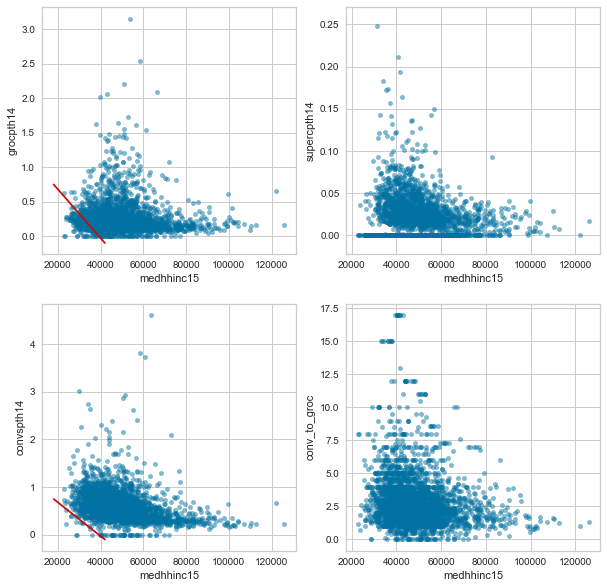
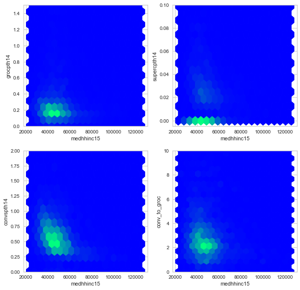
The red lines in the grocery and conevnience store plots show that very few low income counties have a low number of convenience stores, but they do have low numbers of grocery stores. This can also be inferred from the bottom right hand graph which shows that the only counties with a high convenience store to grocery + super store ratio are lower income counties.
Since these points have significant overlap, I will also plot a heatmap of these variables. Note the y-axes have smaller ranges than in the scatter plots.
f, axes = plt.subplots(2, 2, figsize=(10,10))
df.plot.hexbin('medhhinc15', 'grocpth14', ylim=(0, 1.5), ax=axes[0,0],
               colormap='winter', colorbar=False, gridsize=(20,20))
df.plot.hexbin('medhhinc15', 'supercpth14', ylim=(-0.005, 0.1), ax=axes[0,1],
               colormap='winter', colorbar=False, gridsize=(20,20))
df.plot.hexbin('medhhinc15', 'convspth14', ylim=(0, 2), ax=axes[1,0],
               colormap='winter', colorbar=False, gridsize=(20,20))
df.plot.hexbin('medhhinc15', 'conv_to_groc', ylim=(0, 10), ax=axes[1,1],
               colormap='winter', colorbar=False, gridsize=(20,20))
plt.show()
Subgroup Analysis
# DataCamp bootstrap functions
def bootstrap_replicate_1d(data, func):
    return func(np.random.choice(data, size=len(data)))

def draw_bs_reps(data, func, size=1):
    """Draw bootstrap replicates."""

    # Initialize array of replicates: bs_replicates
    bs_replicates = np.empty(size)

    # Generate replicates
    for i in range(size):
        bs_replicates[i] = bootstrap_replicate_1d(data, func)

    return bs_replicates

# My bootstrap function
def compare(data1, data2, func, confidence=95, size=1):
    bs1 = draw_bs_reps(data1, func, size)
    bs2 = draw_bs_reps(data2, func, size)
    bs_diff = bs2 - bs1
    bs_confidence = np.percentile(bs_diff,
                                  [(100-confidence)/2,
                                   95 + (100-confidence)/2])
    measured_diff = func(bs2) - func(bs1)

    return {'measured': measured_diff,
            'bs_low': bs_confidence[0],
            'bs_high': bs_confidence[1],
            'bootstrap': bs_diff}

categorical_columns = df.loc[:, df.dtypes == 'category'].columns
bootstrap_categorical = {}
for col in categorical_columns:
    bootstrap_categorical[col] = compare(df.loc[df[col] == 0, 'conv_to_groc'],
                                         df.loc[df[col] == 1, 'conv_to_groc'],
                                         np.mean,
                                         95,
                                         10000)

bs_cat = pd.DataFrame(bootstrap_categorical).transpose()
errors = np.array(list(zip(abs(bs_cat['bs_high']-bs_cat['measured']),
                           abs(bs_cat['bs_low']-bs_cat['measured']))))
           .transpose()
plt.figure(figsize=(5,5))
plt.barh(bs_cat.index, bs_cat['measured'], xerr=errors, color='white')
plt.axvline(0)
plt.show()
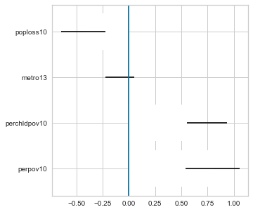
If the confidence interval overlaps 0 like for metro13, there is no significant difference. The subgroups of the other three variables, however, do have a significant difference in the mean ratio of convenience to grocery stores.
for col in categorical_columns:
    print(col, ttest_ind(df.loc[df[col] == 0, 'conv_to_groc'].dropna(),
                         df.loc[df[col] == 1, 'conv_to_groc'].dropna())[1])

perpov10      4.727e-12
perchldpov10  8.176e-18
metro13       0.269
poploss10     1.316e-05
The t-test gives the same result as bootstrapping a 95% confidence interval.
categorical_columns = ['perpov10', 'perchldpov10']
bootstrap_categorical = {}
for col in categorical_columns:
    bootstrap_categorical[col] = compare(df.loc[df[col] == 0, 'povrate15'].dropna(),
                                         df.loc[df[col] == 1, 'povrate15'].dropna(),
                                         np.mean,
                                         95,
                                         10000)
    print(col, list(bootstrap_categorical[col][x] for x in ['measured', 'bs_low', 'bs_high']))

perpov10      [13.21, 12.59, 13.85]
perchldpov10  [10.40, 9.945, 10.88]

categorical_columns = ['perpov10', 'perchldpov10']
bootstrap_categorical = {}
for col in categorical_columns:
    bootstrap_categorical[col] = compare(df.loc[df[col] == 0, 'povrate15'].dropna(),
                                         df.loc[df[col] == 1, 'povrate15'].dropna(),
                                         np.median,
                                         95,
                                         10000)
    print(col, list(bootstrap_categorical[col][x] for x in ['measured', 'bs_low', 'bs_high']))

perpov10      [12.20, 11.4, 13.1]
perchldpov10  [9.799, 9.20, 10.3]

pd.crosstab(df['perpov10'], df['perchldpov10'])
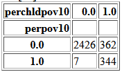
Very often both 'perpov10' and 'perchldpov10' are both 0.
If 'perchldpov10' is 1, there is ~50% chance that 'perpov10' is 1 as well.
If 'perpov10' is 1, there is ~98% chance that 'perchldpov10' is 1 as well.
Building a Model
Table of Contents
def rmse_score(reg, X, y):
    y_pred = reg.predict(X)
    return math.sqrt(mean_squared_error(y, y_pred))

X = df.drop(df.columns[1:5], axis=1)
X = X.reset_index(level='State')
X['State'] = X['State'].astype('category')
X = pd.get_dummies(X, drop_first=True)
y = df.iloc[:, 4].copy()

# I ran this once to create the holdout sets and save them. This way rerunning the notebook should give similar results.

# X_train, X_holdout, y_train, y_holdout = train_test_split(X, y, test_size=0.3)
# X_test, X_final, y_test, y_final = train_test_split(X_holdout, y_holdout, test_size=0.5)

# X_train.to_pickle('Data/X_train.pkl')
# X_test.to_pickle('Data/X_test.pkl')
# X_final.to_pickle('Data/X_final.pkl')
# y_train.to_pickle('Data/y_train.pkl')
# y_test.to_pickle('Data/y_test.pkl')
# y_final.to_pickle('Data/y_final.pkl')

X_train = pd.read_pickle('Data/X_train.pkl')
X_test = pd.read_pickle('Data/X_test.pkl')
X_final = pd.read_pickle('Data/X_final.pkl')
y_train = pd.read_pickle('Data/y_train.pkl')
y_test = pd.read_pickle('Data/y_test.pkl')
y_final = pd.read_pickle('Data/y_final.pkl')

# For the linear regressions, the features should be scaled.
scaler = RobustScaler()
X_lin_train = scaler.fit_transform(X_train)
X_lin_test = scaler.transform(X_test)

y_stats = pd.DataFrame({'train': y_train.describe(),
                         'test': y_test.describe(),
                         'final': y_final.describe()})
y_stats
Regressions on dataset before feature engineering
I will start by calculating the RMSE of using the mean as the predicted value.
y_pred = np.full_like(y_test, y_train.mean())
print(math.sqrt(mean_squared_error(y_test, y_pred)))

1.879
As a baseline, I will start with simple linear regression and the regularized versions: lasso, ridge, and elastic net as well as random forest and gradient boosting.
linear = LinearRegression()
lasso = LassoCV(alphas=[1e-2, 1e-1, 1, 10],
                cv=10)
ridge = RidgeCV(alphas=[1e-3, 1e-2, 1e-1, 1, 10],
                cv=10)
elastic = ElasticNetCV(l1_ratio=[.1, .5, .7, .9, .95, .99, 1],
                       alphas=[1e-2, 1e-1, 1, 10],
                       cv=10,
                       n_jobs=-1)
regs = {'Linear': linear,
        'Lasso': lasso,
        'Ridge': ridge,
        'Elastic Net': elastic}

for name, reg in regs.items():
    reg.fit(X_lin_train, y_train)
    print(name, rmse_score(reg, X_lin_test, y_test))

Linear       1.775
Lasso        1.789
Ridge        1.778
Elastic Net  1.784

rf = RandomForestRegressor(n_estimators=100, max_features='sqrt')
rf_scores = np.empty(10)
for i in range(10):
    rf.fit(X_train, y_train)
    rf_scores[i] = rmse_score(rf, X_test, y_test)
print(rf_scores.mean())

1.770

gb = GradientBoostingRegressor(max_features='sqrt', max_depth=1)
gb_scores = np.empty(10)
for i in range(10):
    gb.fit(X_train, y_train)
    gb_scores[i] = rmse_score(gb, X_test, y_test)
print(gb_scores.mean())

1.755
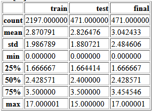
Smaller root mean squared errors (RMSE) are better, but there is no absolute scale to determine what a good RMSE is. I have found two ways people have used to assess RMSE scores. The first is to compare it to the standard deviation of the test set. The second is to compare it to the RMSE of using the mean of the train set as the predicted value. For this test set both are ~1.88. After looking at the math of these methods, I realized that these are the same equation excpet the first uses the mean of the test set and the second, the mean of the train set so the values should be similar.
With this method of determining goodness of fit, none of these models preform all that well, but the best is definietly gradient boosting.
Feature selection and engineering
Income Features
In the dataset there is a feature that contains the median household income in each county and there is also a set of features that represent the percentage of income tax filings in each of 8 ranges. I will investigate if these are interacting in a way that effects the fit of the models.
# Remove the household income column
X_tax_train = X_train.loc[:, X_train.columns!='medhhinc15']
X_tax_test = X_test.loc[:, X_test.columns!='medhhinc15']
# Remove the tax bracket columns
X_inc_train = X_train.drop(X_train.columns[14:22], axis=1)
X_inc_test = X_test.drop(X_test.columns[14:22], axis=1)

gb1 = GradientBoostingRegressor(max_features='sqrt', max_depth=1)
gb1_scores = np.empty(10)
for i in range(10):
    gb1.fit(X_tax_train, y_train)
    gb1_scores[i] = rmse_score(gb1, X_tax_test, y_test)
print(gb1_scores.mean())

1.757

gb2 = GradientBoostingRegressor(max_features='sqrt', max_depth=1)
gb2_scores = np.empty(10)
for i in range(10):
    gb2.fit(X_inc_train, y_train)
    gb2_scores[i] = rmse_score(gb2, X_inc_test, y_test)
print(gb2_scores.mean())

1.757
These scores are very close to each other and to the score for the whole dataset so I will not remove either feature.
Interaction terms
I will use the PolynomialFeatures function to create interaction terms as well as squares of the features.
poly = PolynomialFeatures(2)
poly_X_train = poly.fit_transform(X_train.iloc[:, :22])
poly_X_test = poly.transform(X_test.iloc[:, :22])
X_poly_train = (pd.DataFrame(poly_X_train,
                             columns=poly.get_feature_names(X_train.columns),
                             index=X_train.index)
                  .merge(X_train.iloc[:, 22:],
                         left_index=True,
                         right_index=True))
X_poly_test = (pd.DataFrame(poly_X_test,
                            columns=poly.get_feature_names(X_test.columns),
                            index=X_test.index)
                 .merge(X_test.iloc[:, 22:],
                        left_index=True,
                        right_index=True))

gb3 = GradientBoostingRegressor(max_features='sqrt', max_depth=1)
gb3_scores = np.empty(10)
for i in range(10):
    gb3.fit(X_poly_train, y_train)
    gb3_scores[i] = rmse_score(gb3, X_poly_test, y_test)
print(gb3_scores.mean())

1.777
This seems to have increased the RMSE so I will not use these features in the hyperparameter tuning.
Hyperparameter tuning
parameters = {'n_estimators': [50, 100, 200],
              'max_features': ['sqrt', 0.5, None],
              'max_depth': [1, 3, 5]}
gb_grid = GridSearchCV(GradientBoostingRegressor(),
                       scoring={'MSE': make_scorer(mean_squared_error,
                                greater_is_better=False)},
                       param_grid=parameters,
                       refit='MSE',
                       cv=10,
                       n_jobs=-1,
                       iid=False)
gb_grid.fit(X_train, y_train)
print(rmse_score(gb_grid, X_test, y_test))

1.757

gb_grid.best_params_

{'max_depth': 3, 'max_features': 'sqrt', 'n_estimators': 50}
Evaluating model
I will use Yellowbrick's ResidualsPlot function to look at the distribution of residuals vs predicted values.
visualizer = ResidualsPlot(gb_grid.best_estimator_)
visualizer.fit(X_train, y_train)
visualizer.score(X_test, y_test)
visualizer.poof()
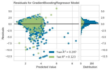
Even though this model is more likely to over-predict the convenience to grocery store ratio, the largest residuals are from very large under-predictions.
Throughout this analysis, I have been using test data to compare models. Now that I am done comparing models, I will use the final holdout set to evaluate the final model.
y_pred = np.full_like(y_final, y_train.mean())
print(math.sqrt(mean_squared_error(y_final, y_pred)))

2.4878948152705957

rmse_score(gb_grid.best_estimator_, X_final, y_final)

2.319
This RMSE appears to be much worse, but as a percent of the standard deviation, the RMSE is similar to that of the test set. I will look at the reiduals plot for this test set as well.
visualizer = ResidualsPlot(gb_grid.best_estimator_)
visualizer.fit(X_train, y_train)
visualizer.score(X_final, y_final)
visualizer.poof()
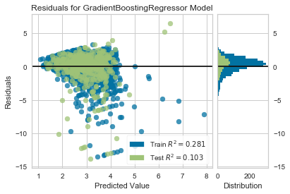
Even though the RMSE is much worse for the 'final' holdout set compared to the 'test' holdout, the R2 value and distribution of residuals is similar. The difference appears to be that the 'final' holdout set contains more counties where this model under-predicts by a wide margin.
Recommendations
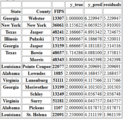
Table of ContentsSomeone interested in everyone having access to the cheaper and fresh food available at grocery stores would likely have two main concerns: improving access and keeping access. Counties where the first is most needed can be identified by looking for the largest values of the conv_to_groc column. My model provides a way of finding counties which may be most at risk of access decreasing by identifying the counties where the predicted values is much larger than the current value.
y_pred = gb_grid.best_estimator_.predict(X)
y_pred = pd.DataFrame(y_pred, index=y.index)
predictions = pd.DataFrame(y).join(y_pred)
predictions.columns = ['y_true', 'y_pred']
predictions['residuals'] = predictions['y_pred'] - predictions['y_true']
top5perc = np.percentile(predictions['residuals'], 95)
over_predictions = predictions[(predictions['residuals'] > top5perc) &
                               (predictions['y_true'] > 0) &
                               (predictions['y_pred'] > 4)]
over_predictions.sort_values(by='residuals', ascending=False)
Conclusions
Table of ContentsI began this project by finding and transforming this data into a usable format. I then explored the data using various types of graphs and statistical techniques. I found multiple features that are correlated with the ratio of convenience stores to grocery stores in a county including:
- percent of the population who identifies as non-hispanic black
- percent of the population who has graduated high school
- percent of the population who has a bachelor's degree
- poverty rate
- median household income
Future Work
After working through much of this project, I found data on the percent of a county's population living within a certain distance of a grocery store. Since this directly measures access, it would be interesting to perform this analysis again with this variable as the target and comparing it with this indirect measurement of access.